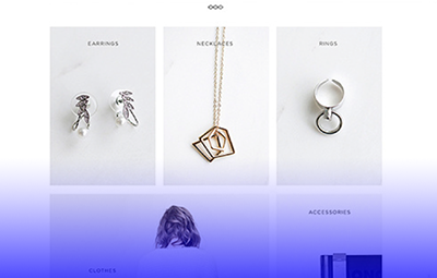
website design
Floralpunk
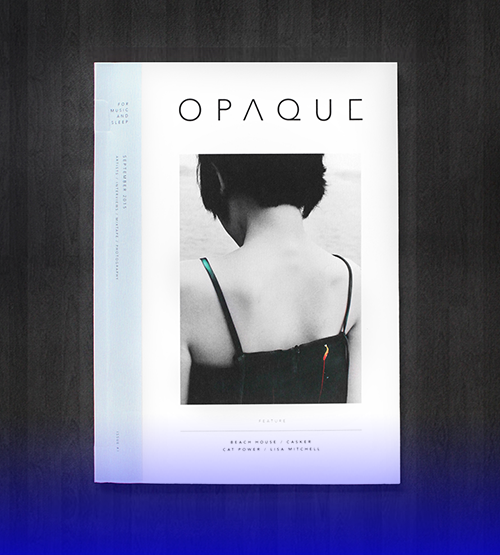
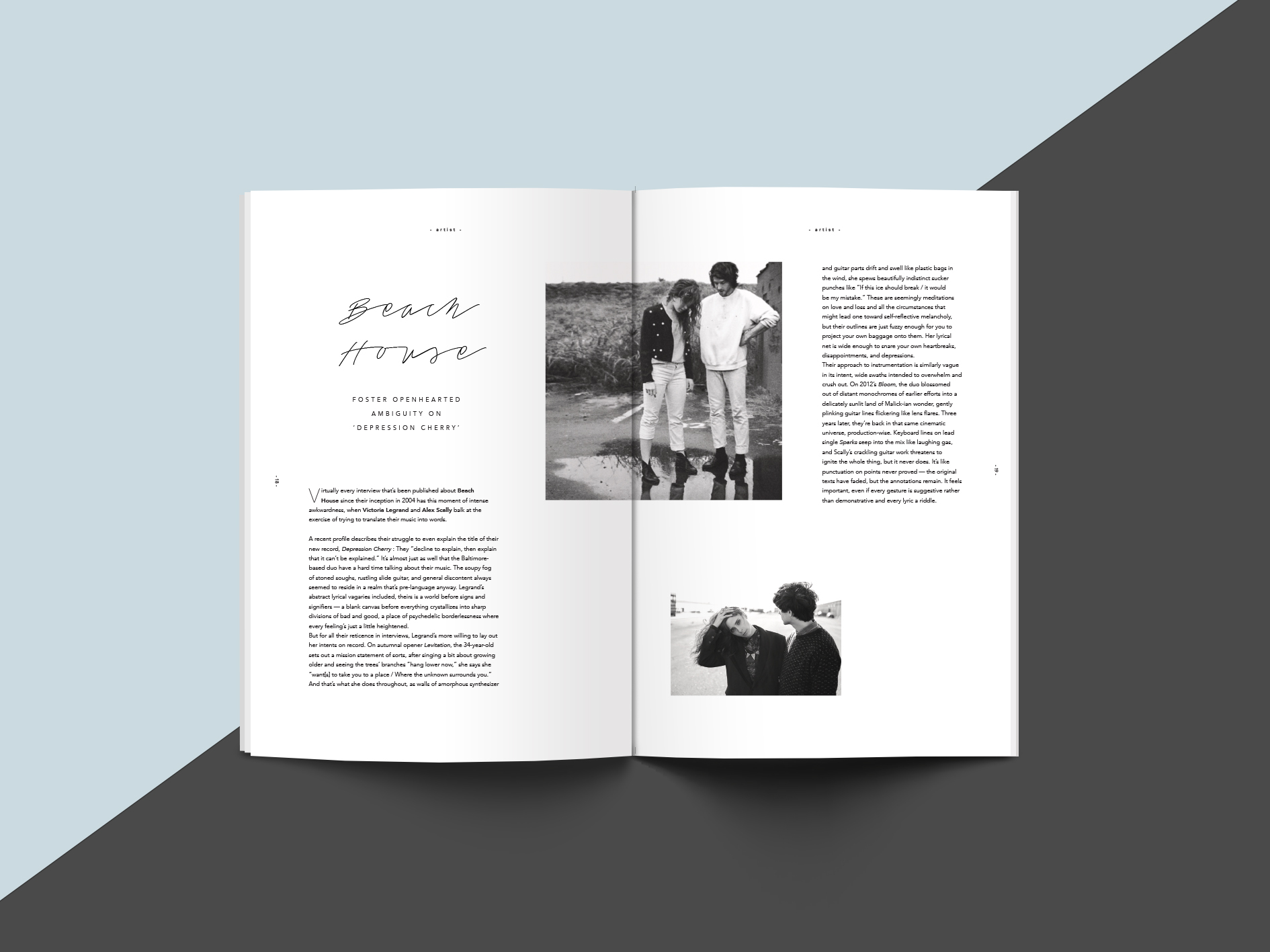
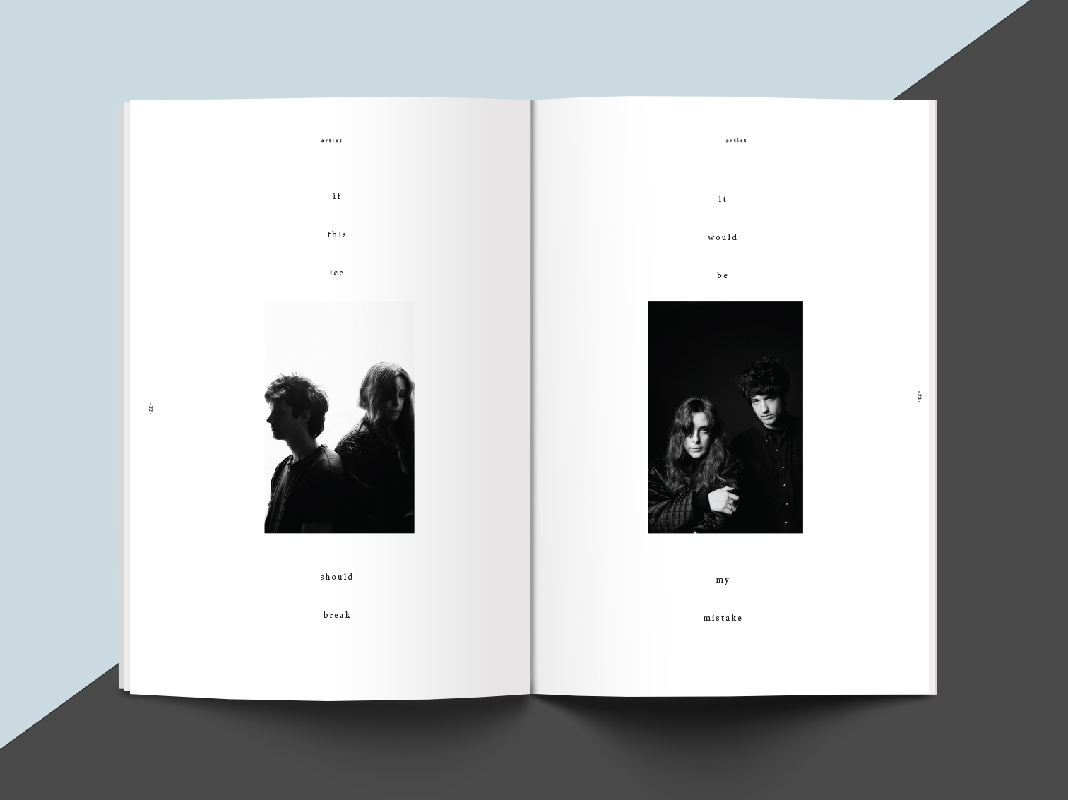
editorial
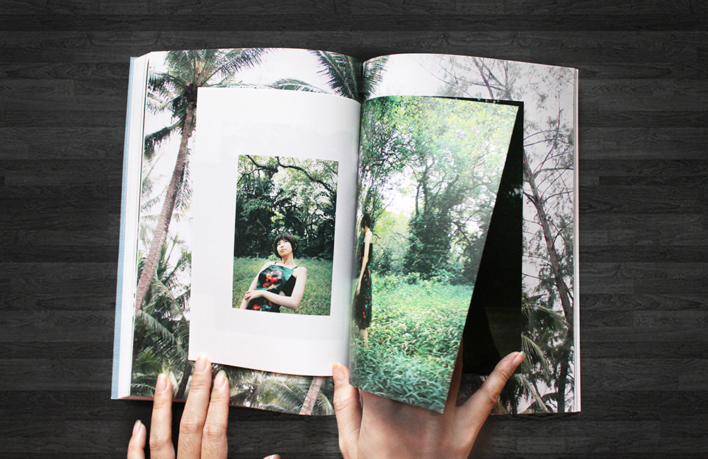
Opaque Magazine

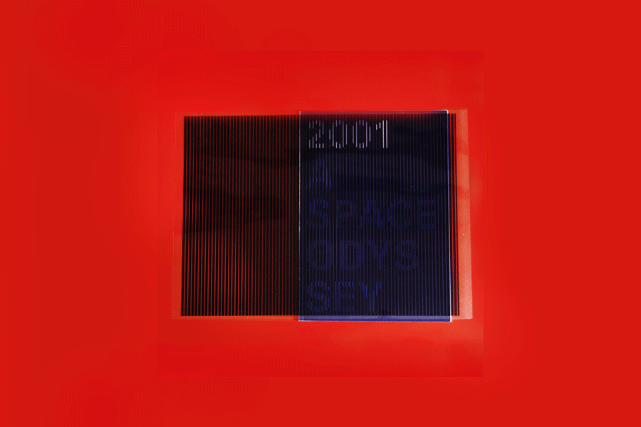
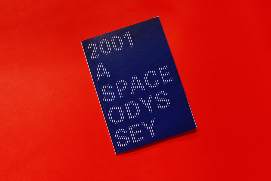
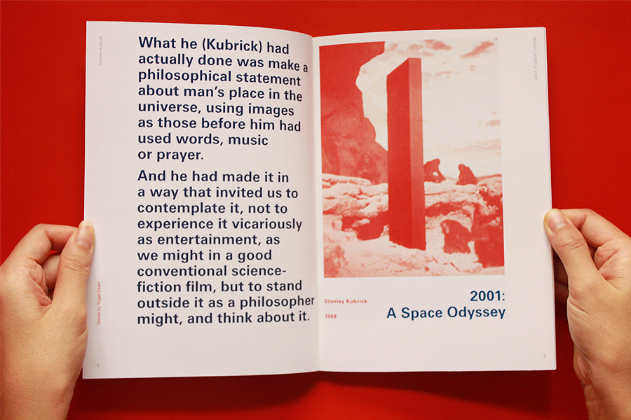
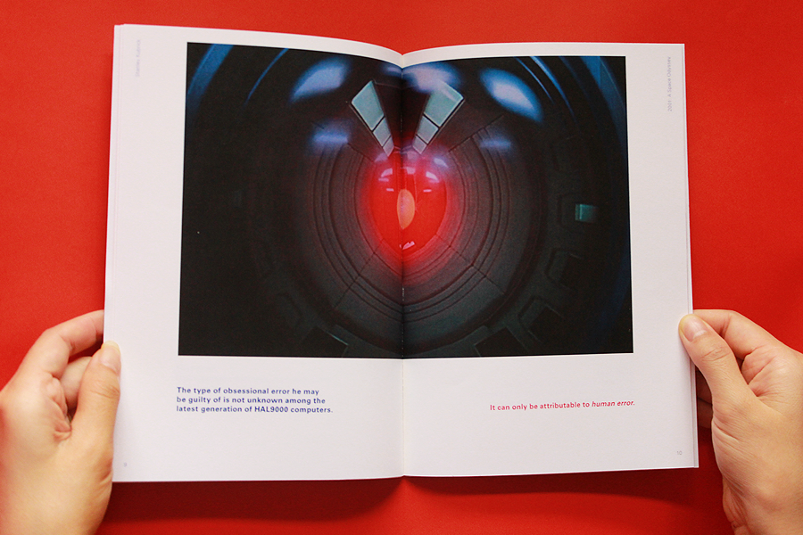
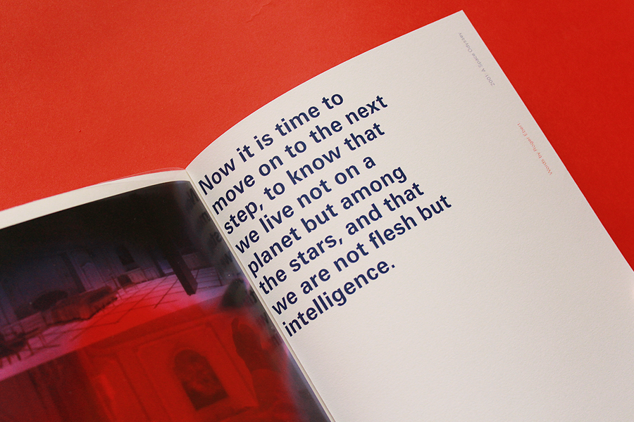
2001: A Space Odyssey
editorial design

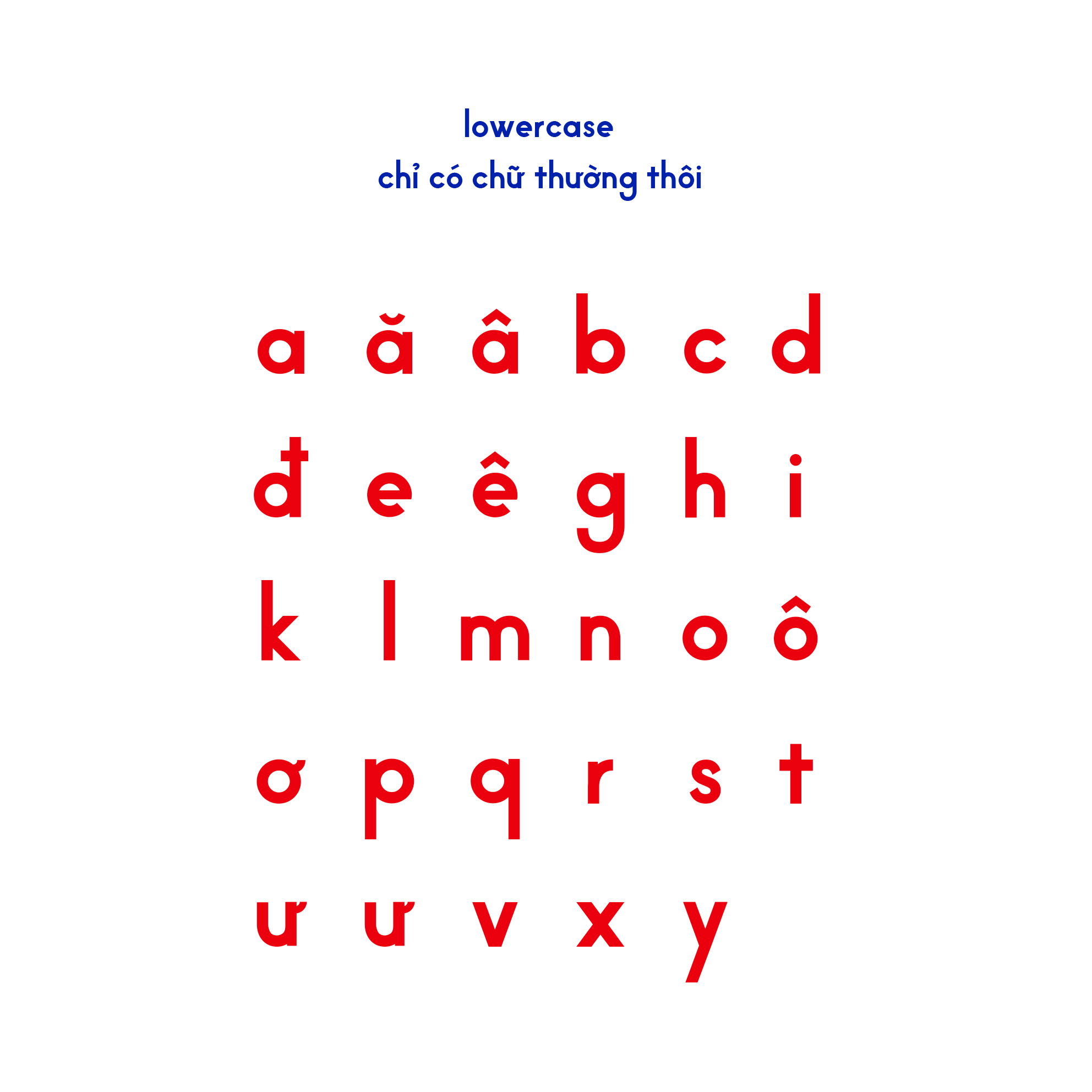
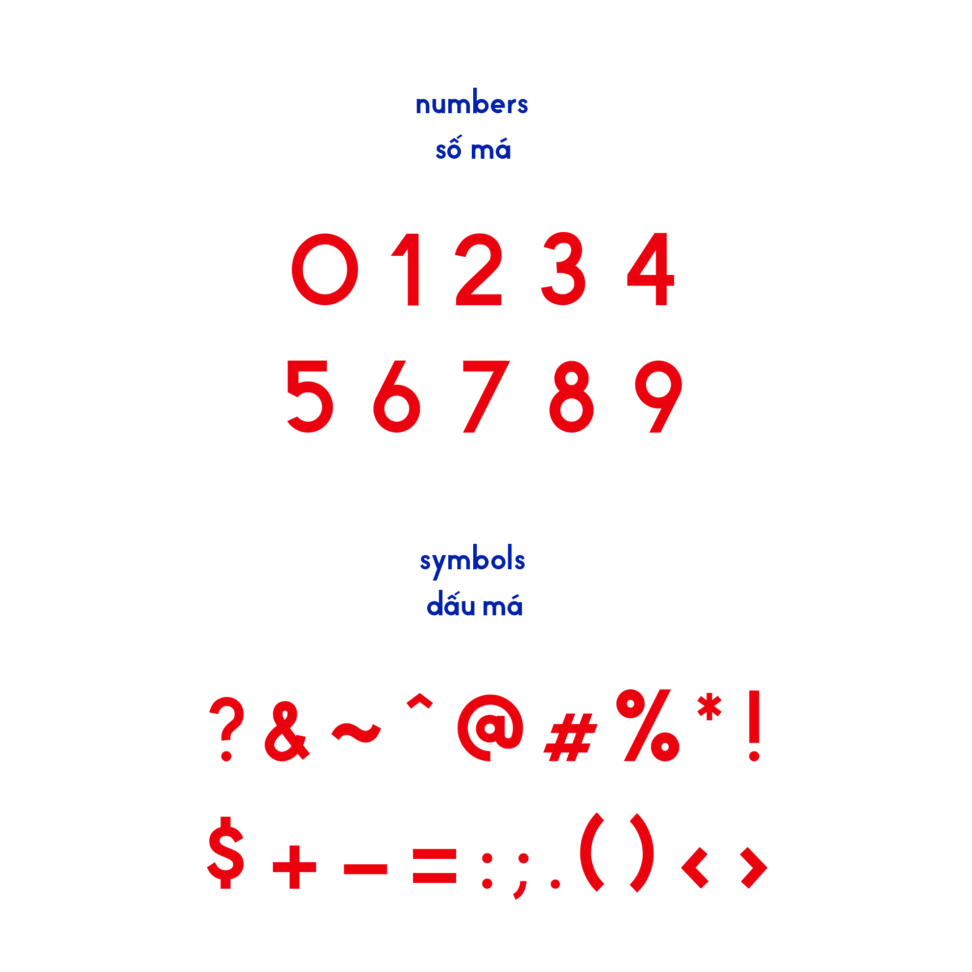
vuông typeface (wip)
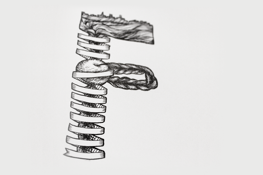
type design

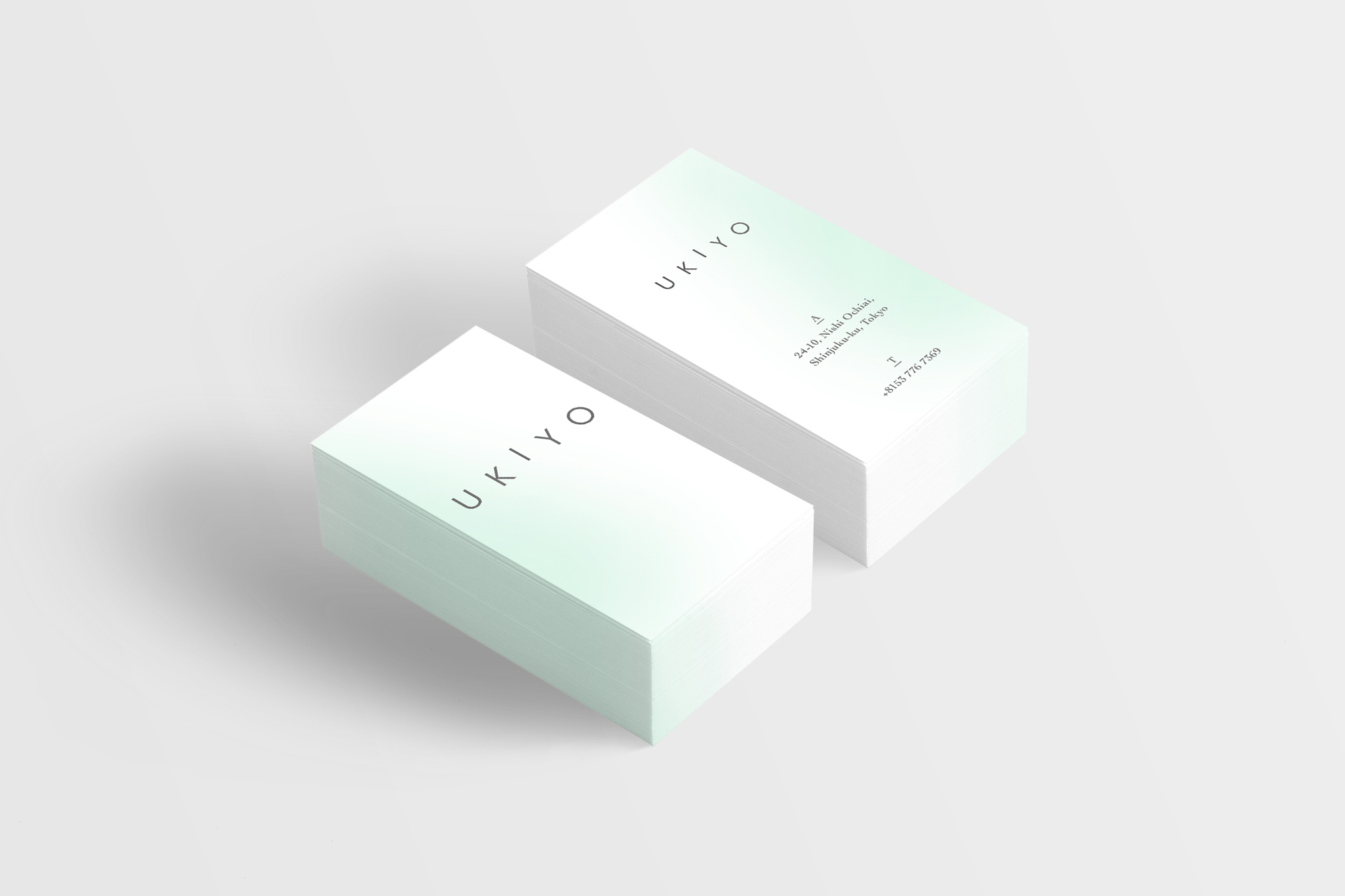
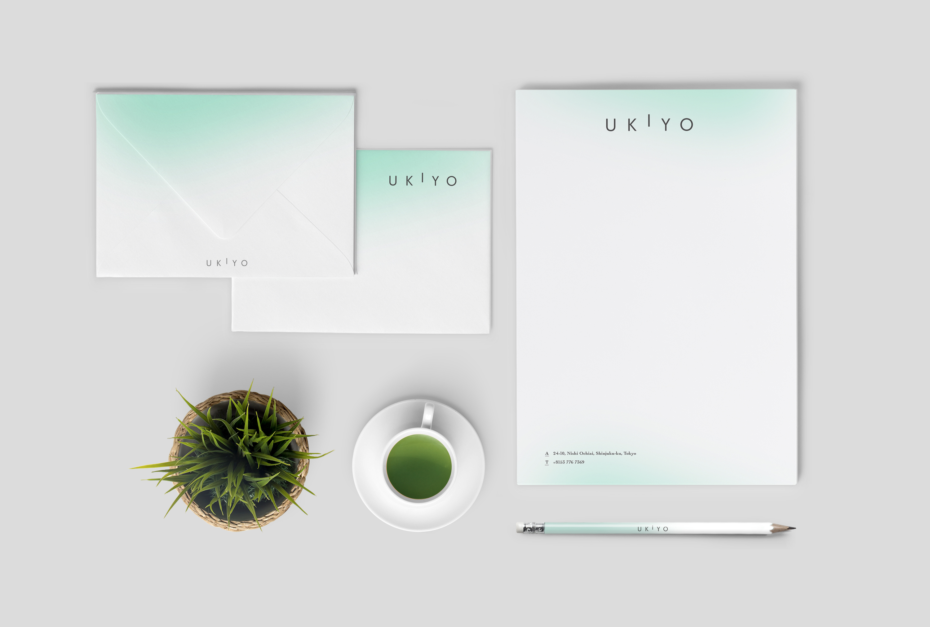
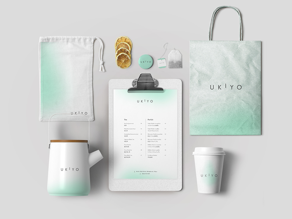
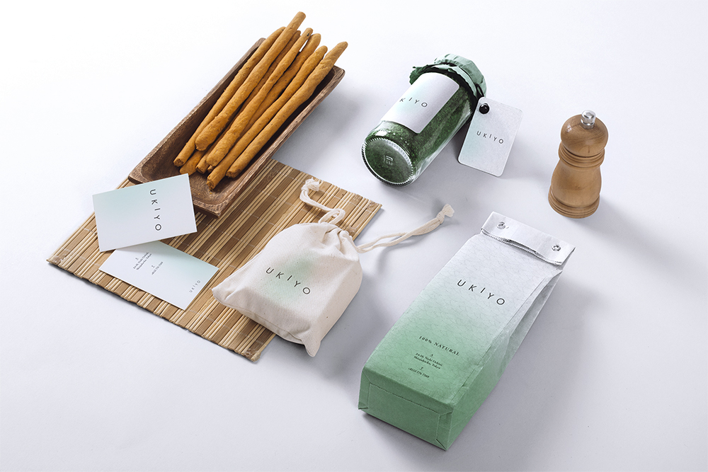
Ukiyo
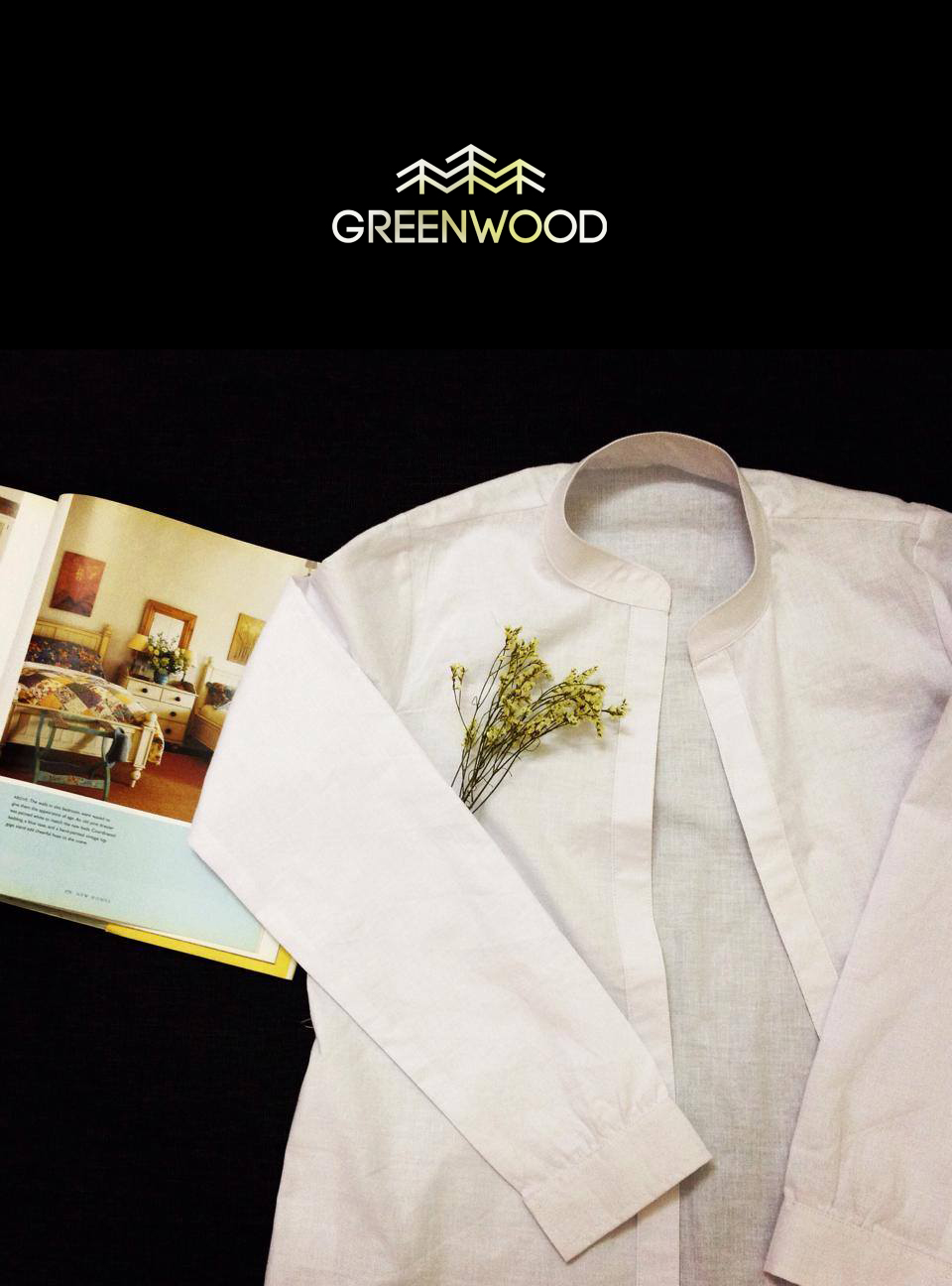
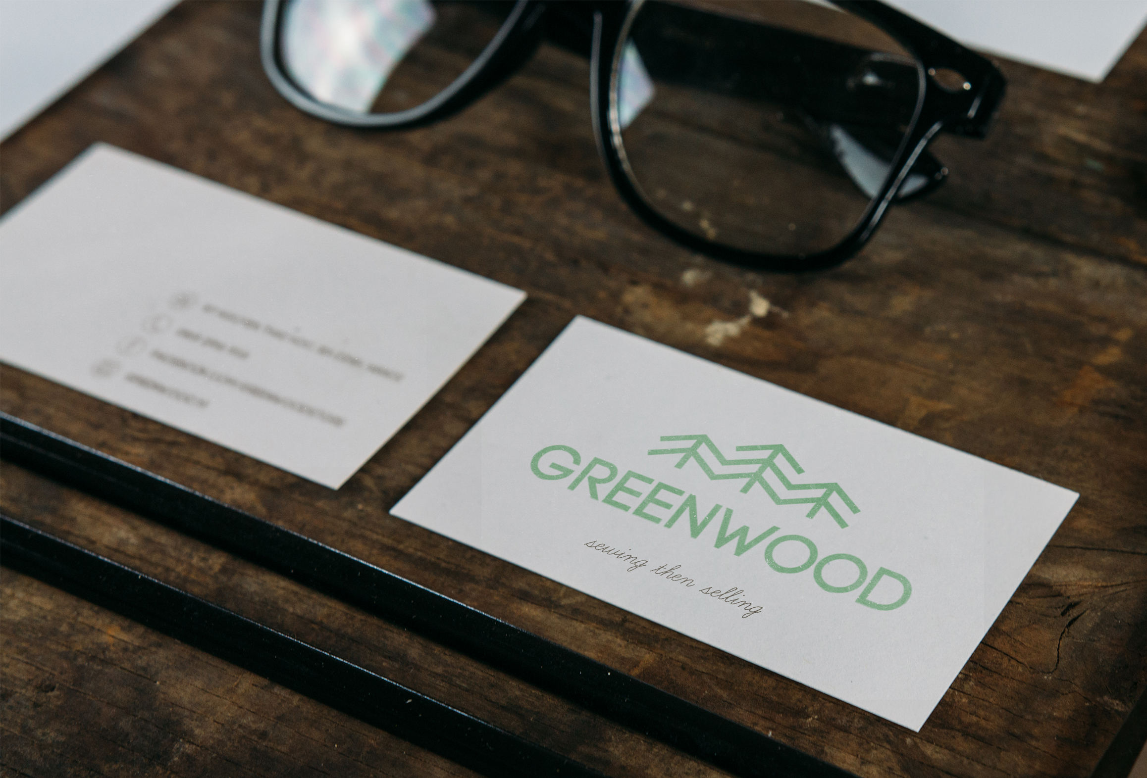
branding
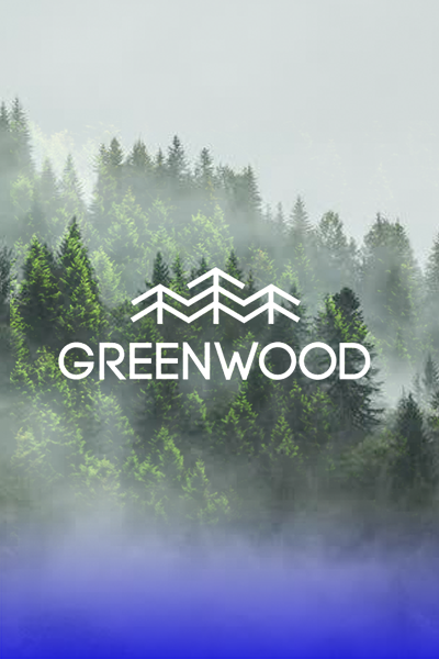
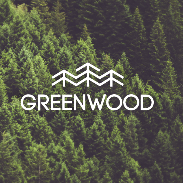
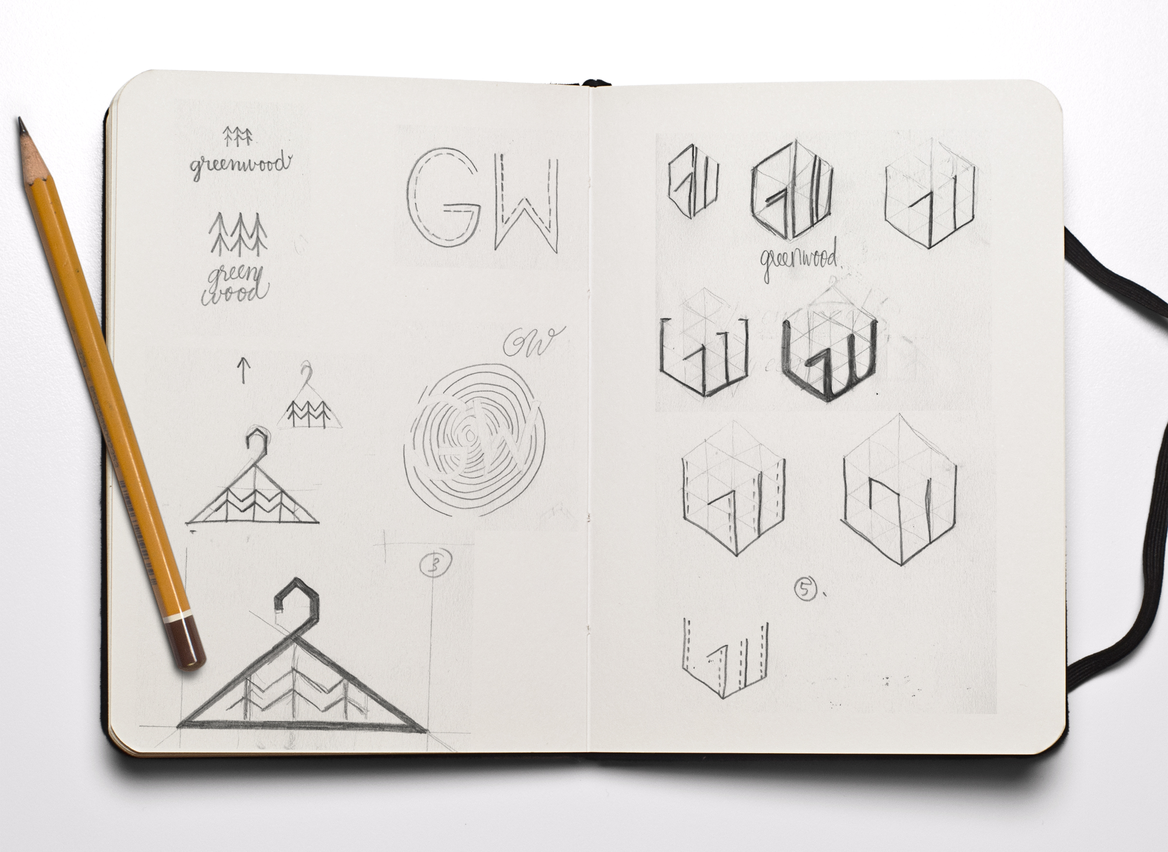
Greenwood
logo design
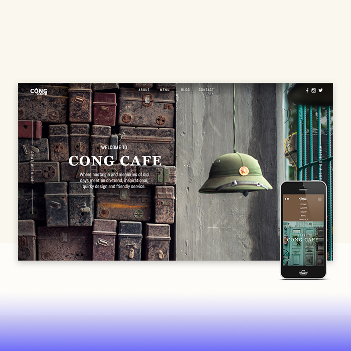
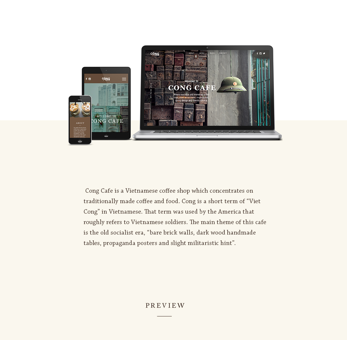
website design
Cong Cafe
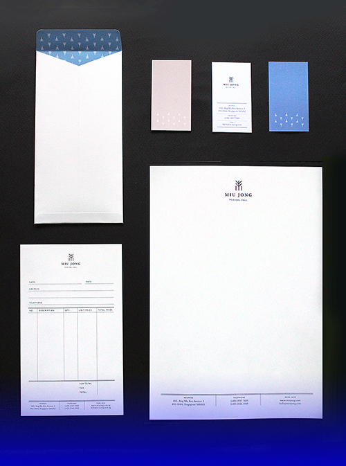
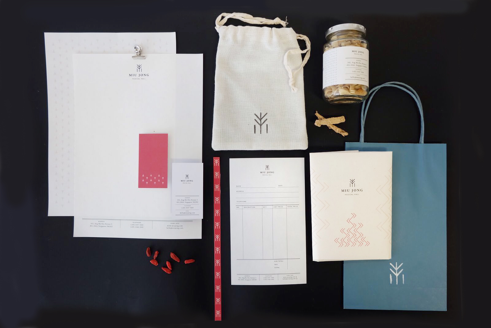
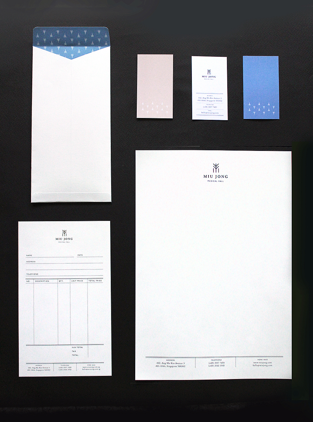
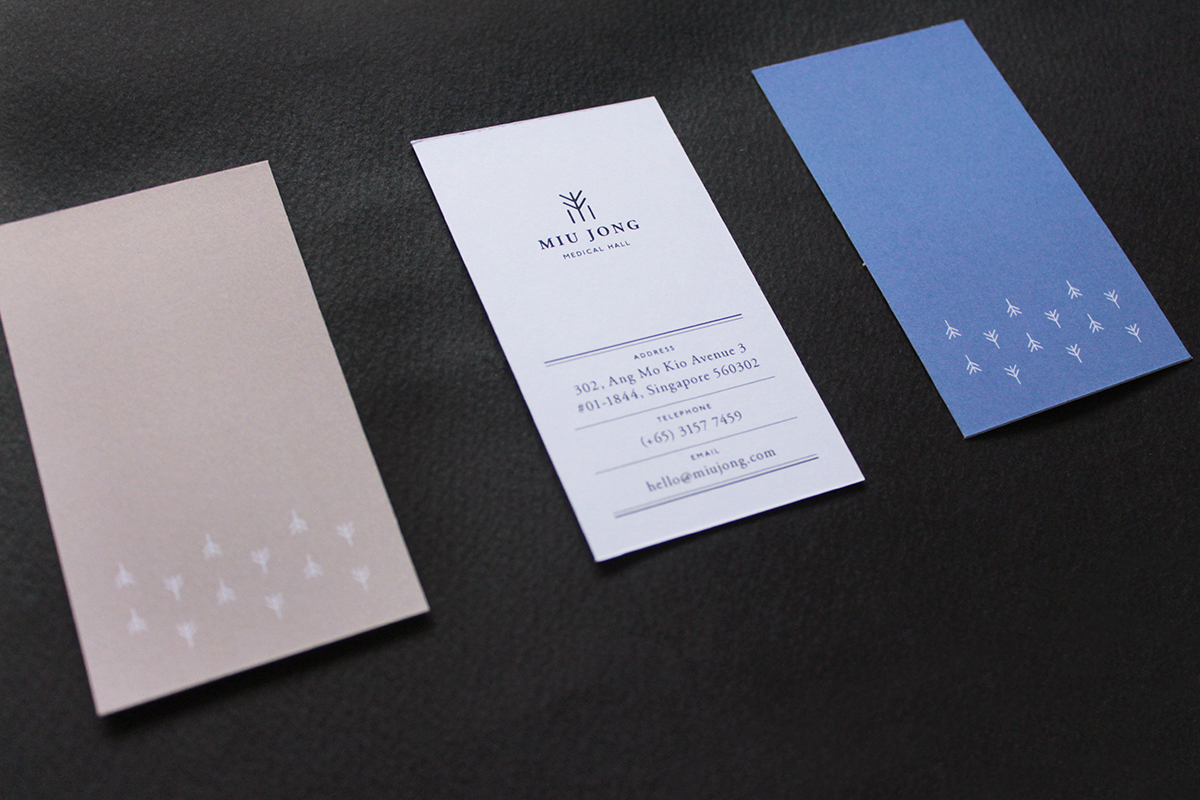
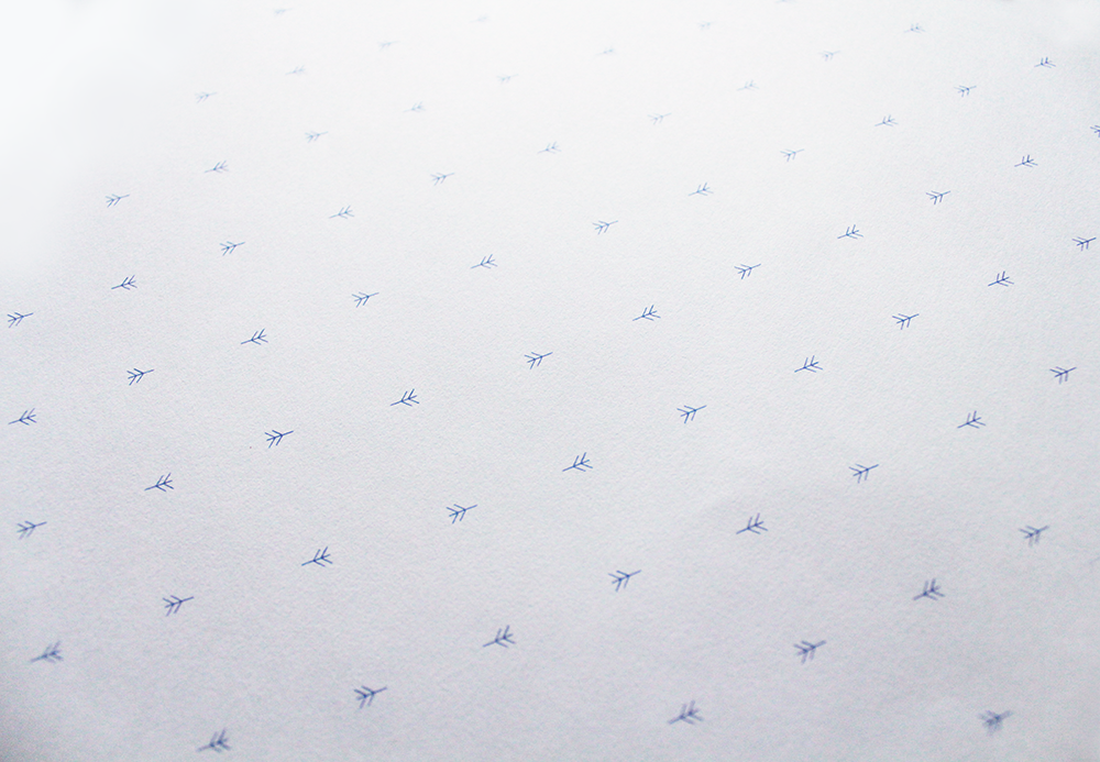
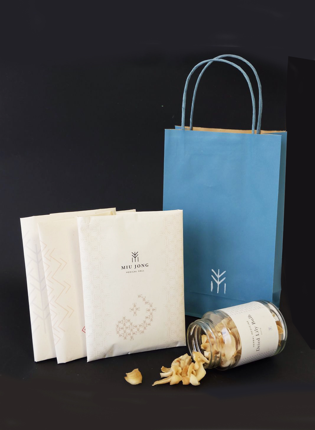
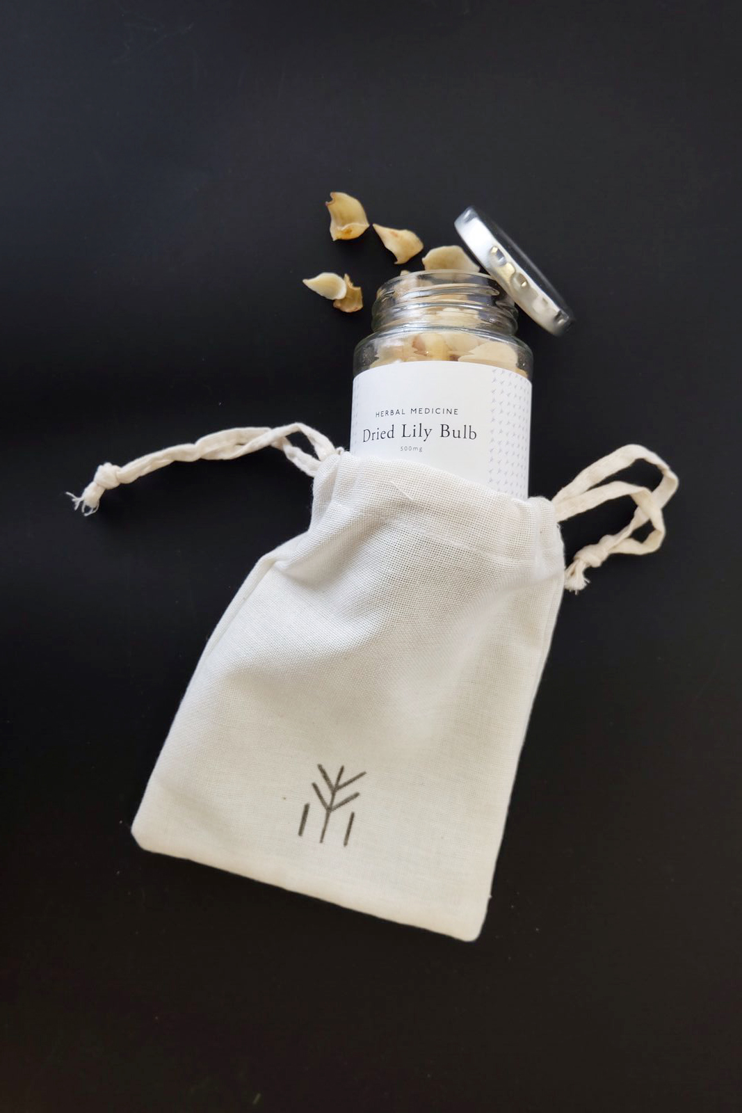
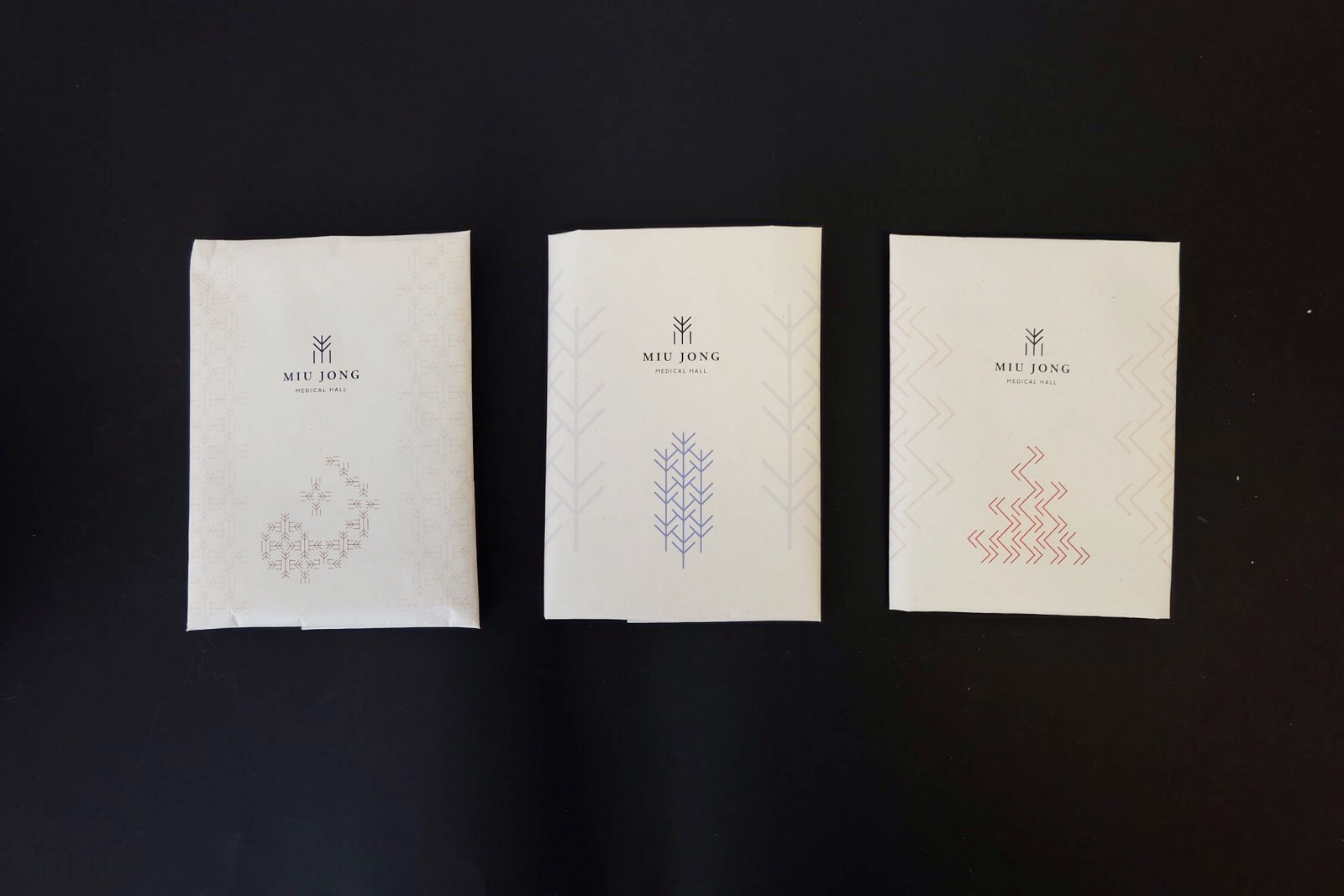
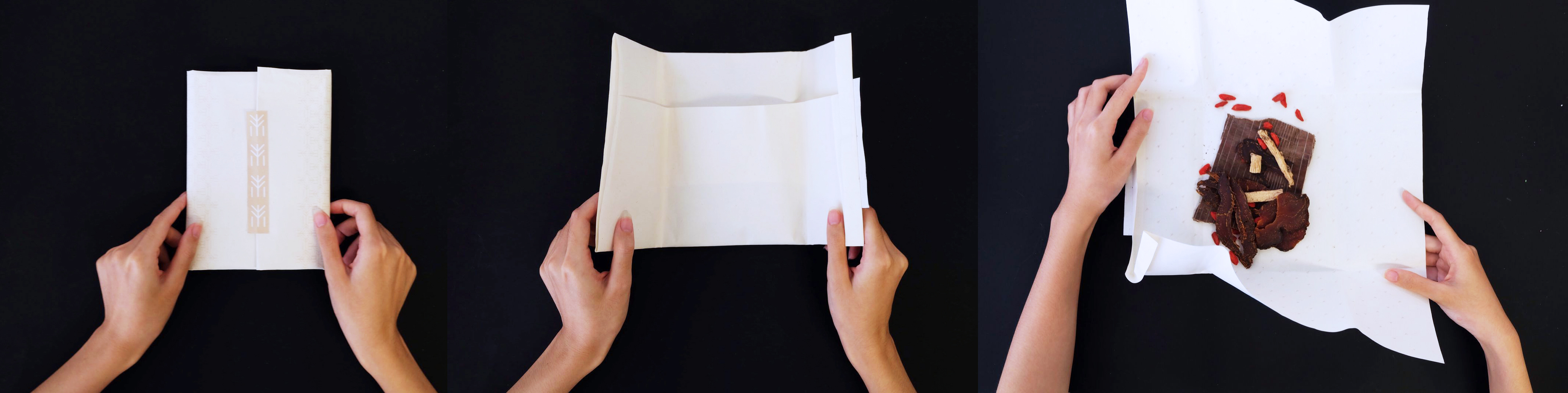
Miu Jong Medical Hall
branding
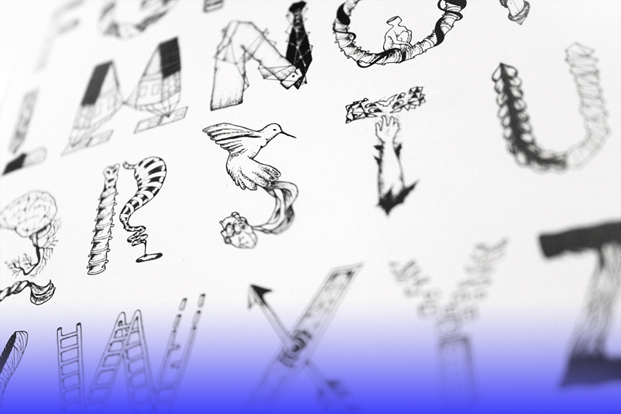
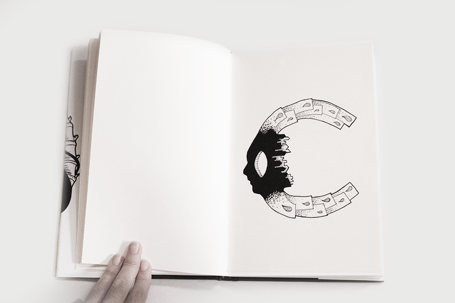
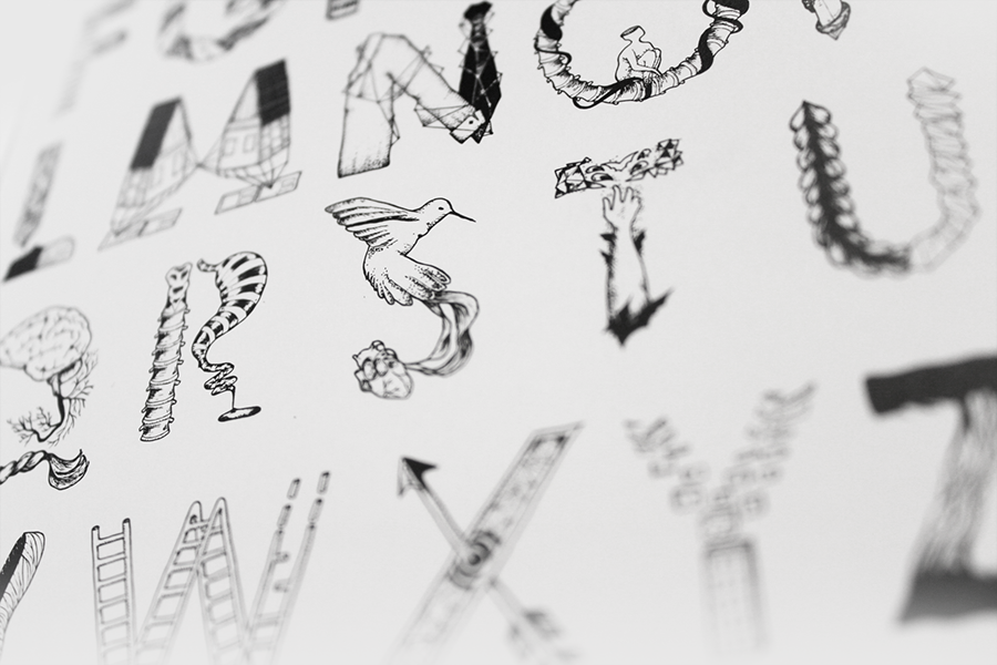
illustration